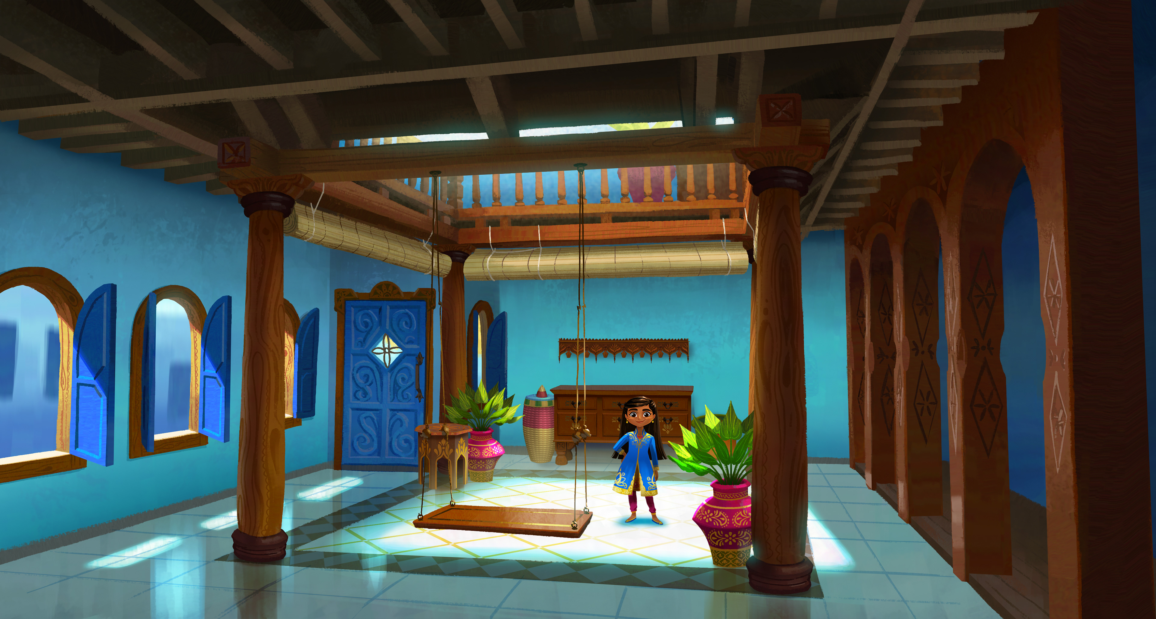
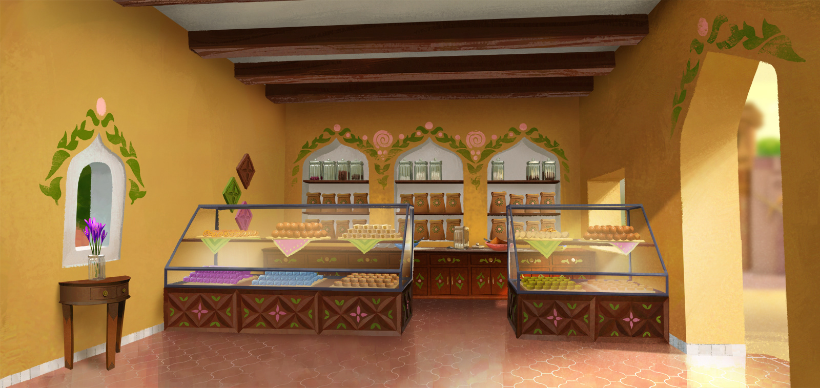
For a show that is mainly set in one city, our locations ran the gamut of design spaces, from the rustic, to the ornate, even to steampunk-inspired! These were some of my favorites from the whole series:
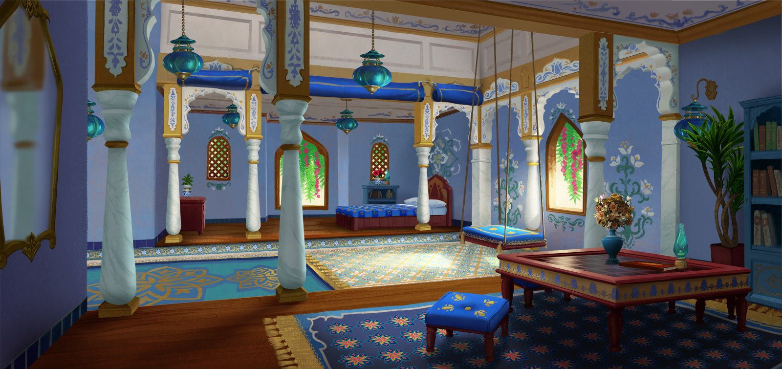
floor tile design by Audrey Gonzalez, rug pattern design by Jia Wang, oil lamp design by Brittany Campbell
Development
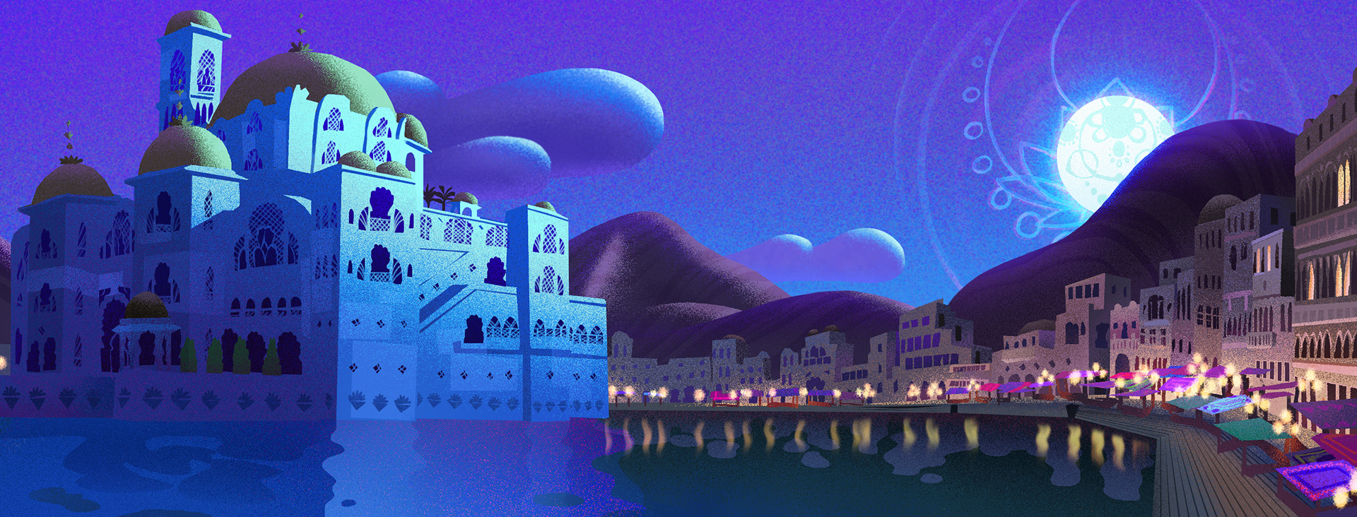
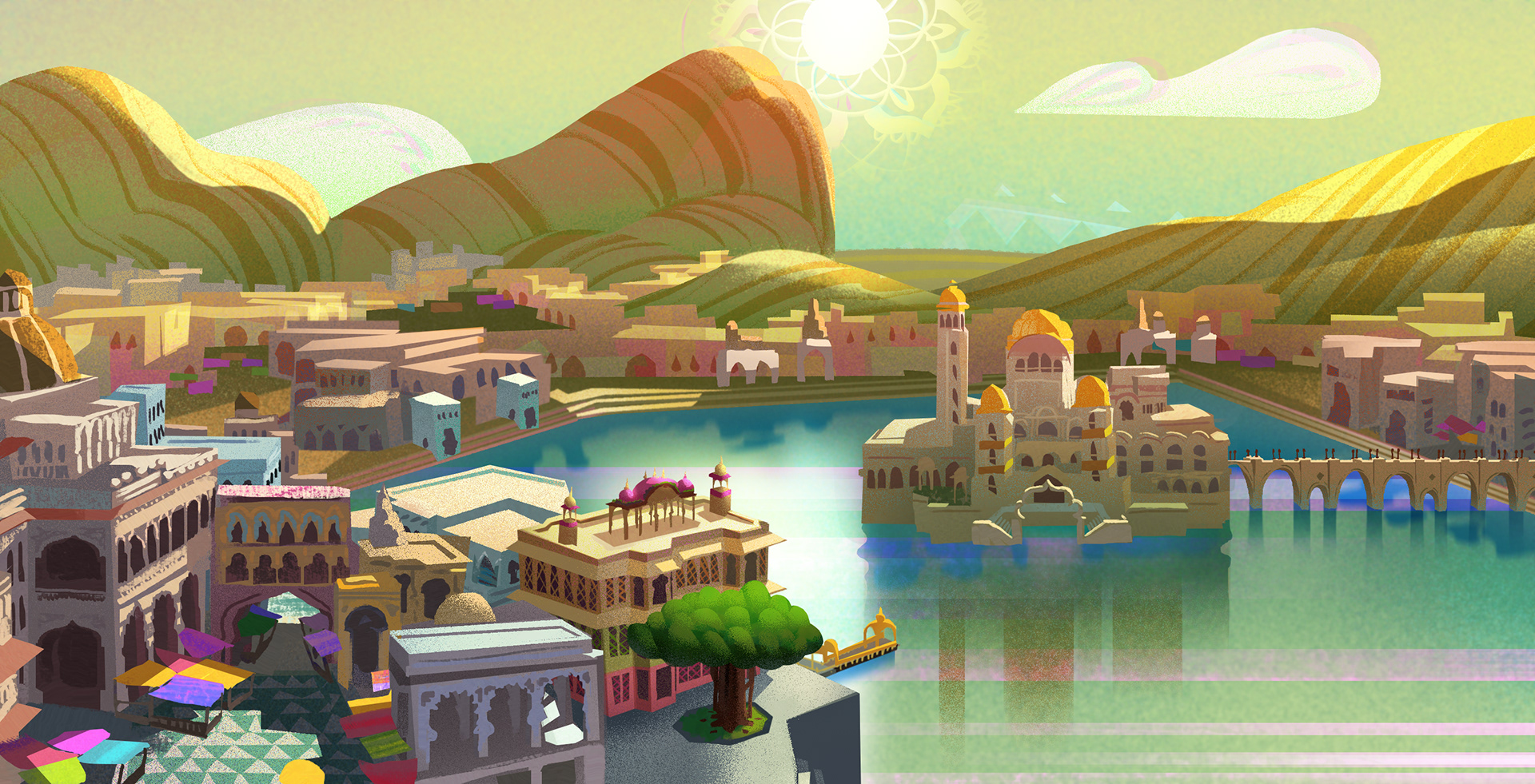
Early on it was decided that the design of the show would be rooted in north Indian culture, drawing from Rajasthani architecture and fashion. The first explorations focused mainly on building forms, color styling, and lighting arrangements.
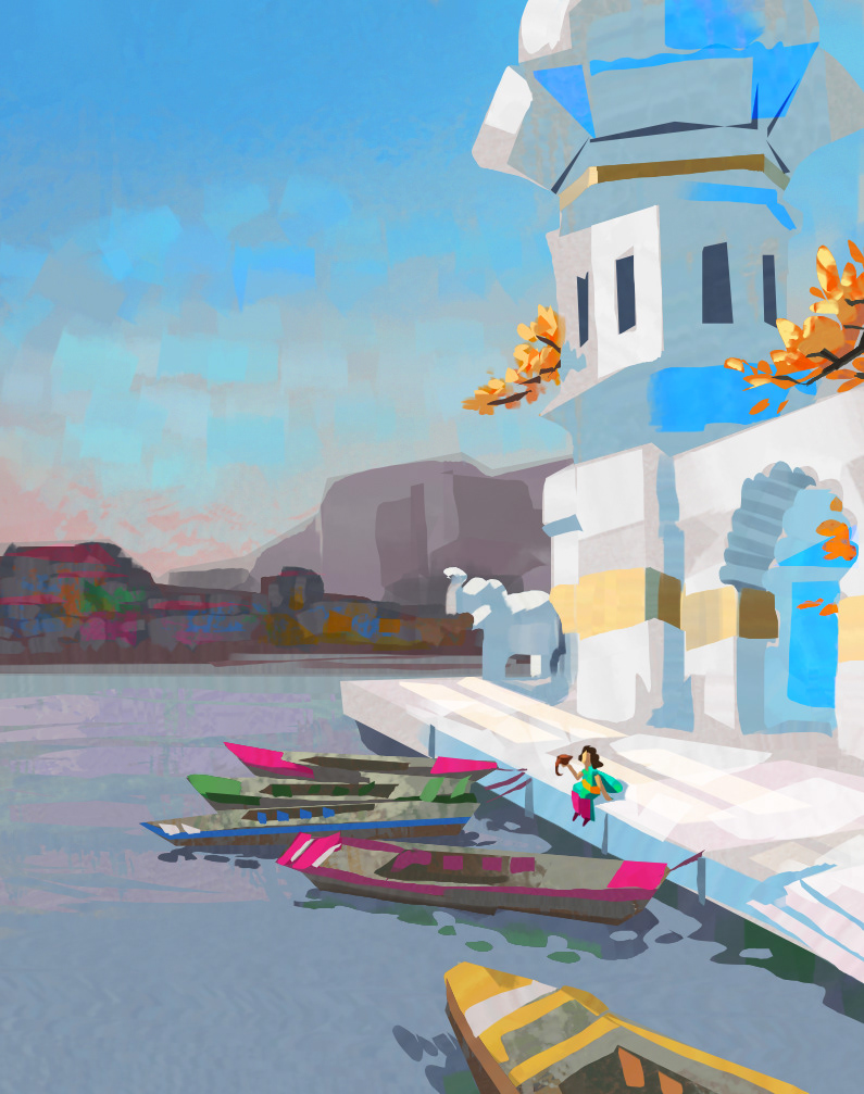
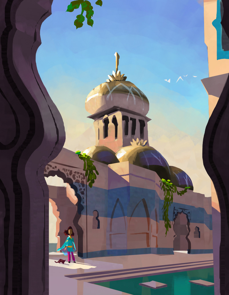
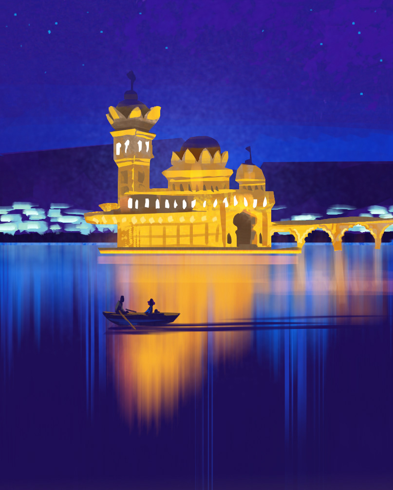
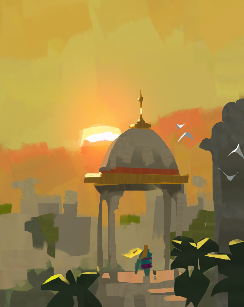
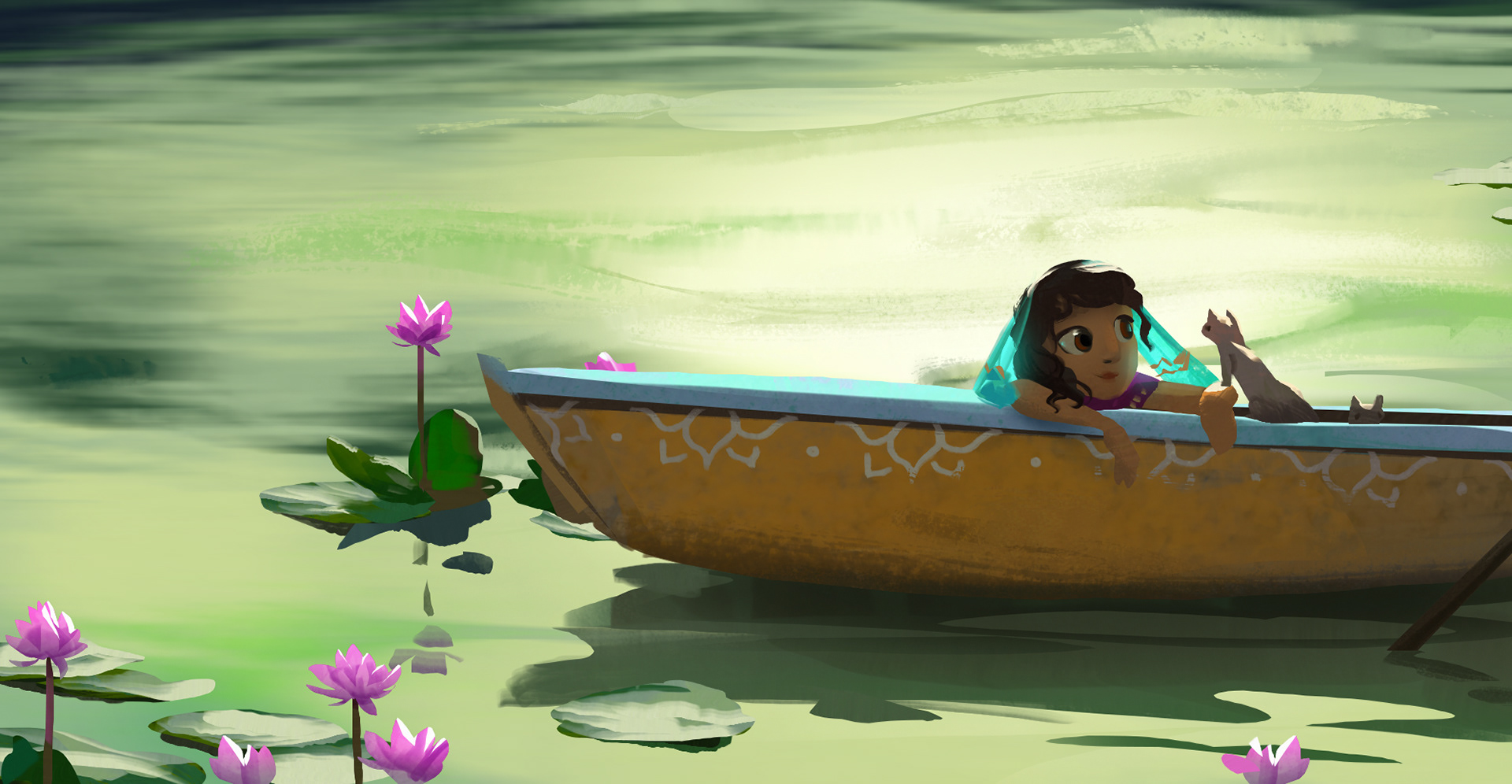
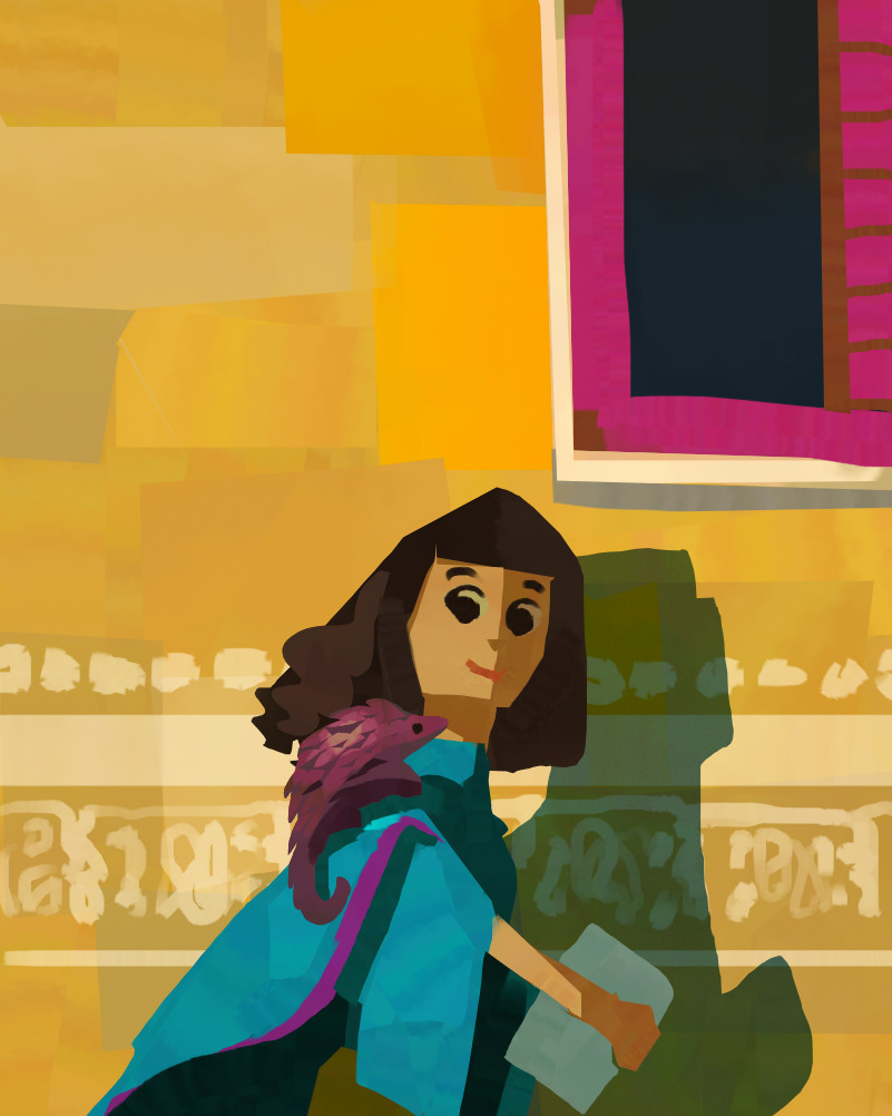
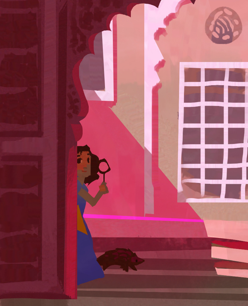
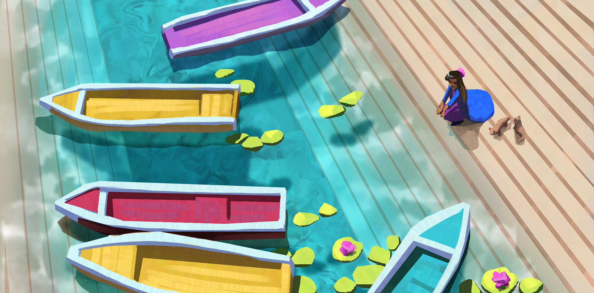
India's textile prowess gave way to one of the biggest stylistic choices for the show, which was to incorporate pattern all across the landscapes. Hills in the background would be swathed with bands, iridescent paisleys swam on the surface of the water, and the sky was dotted with swirling clouds.
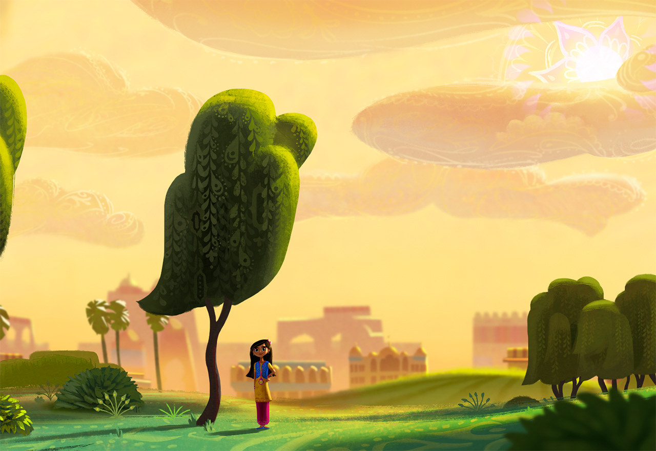
character design by Michelle Lin
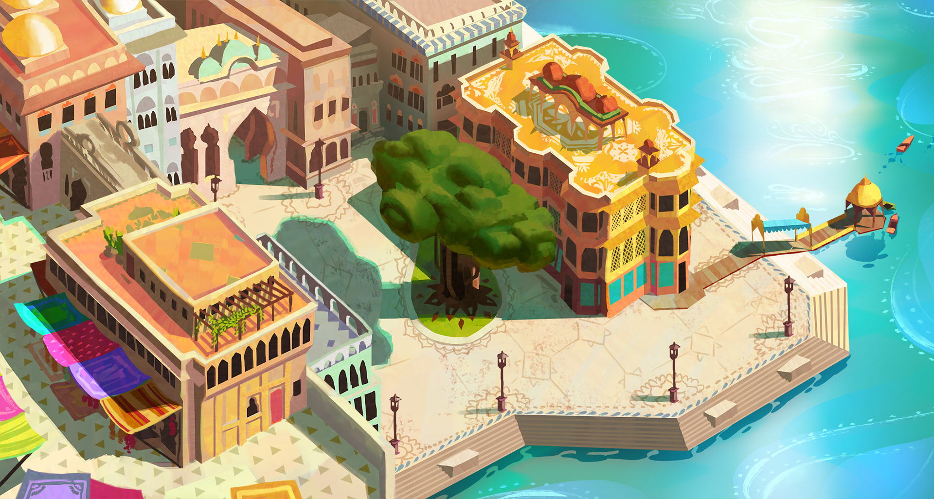
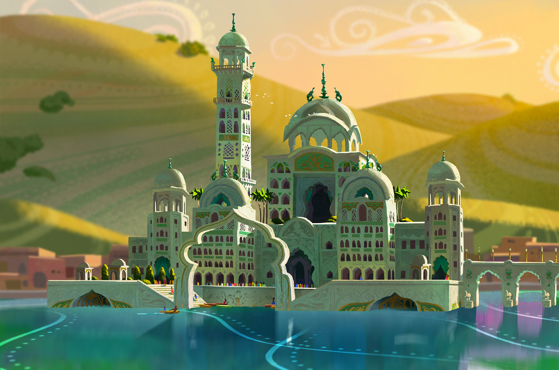
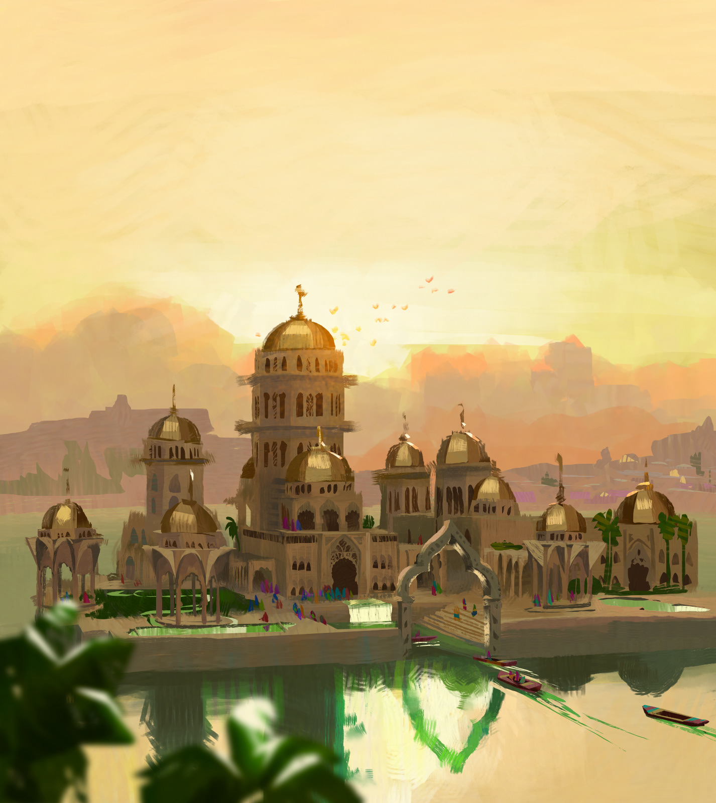
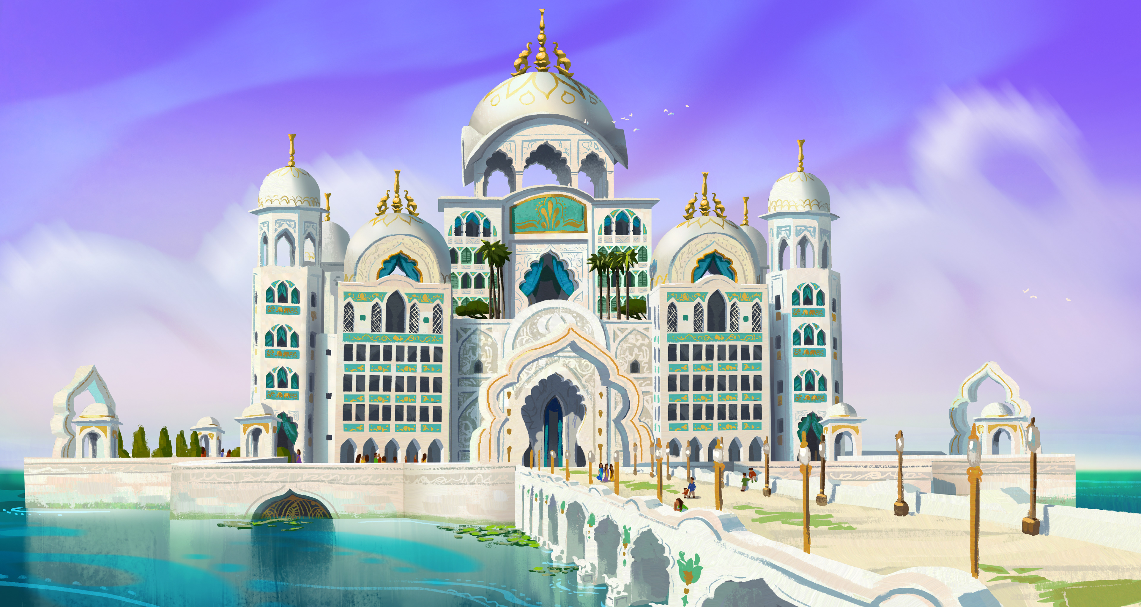
Domes and scalloped archways are some of the architectural hallmarks of the Indo-Islamic style, as reflected in all explorations of the designs for the palace. The identity of Jalpur as a coastal city influenced the palace's ghat-like entry point for boats on either side.
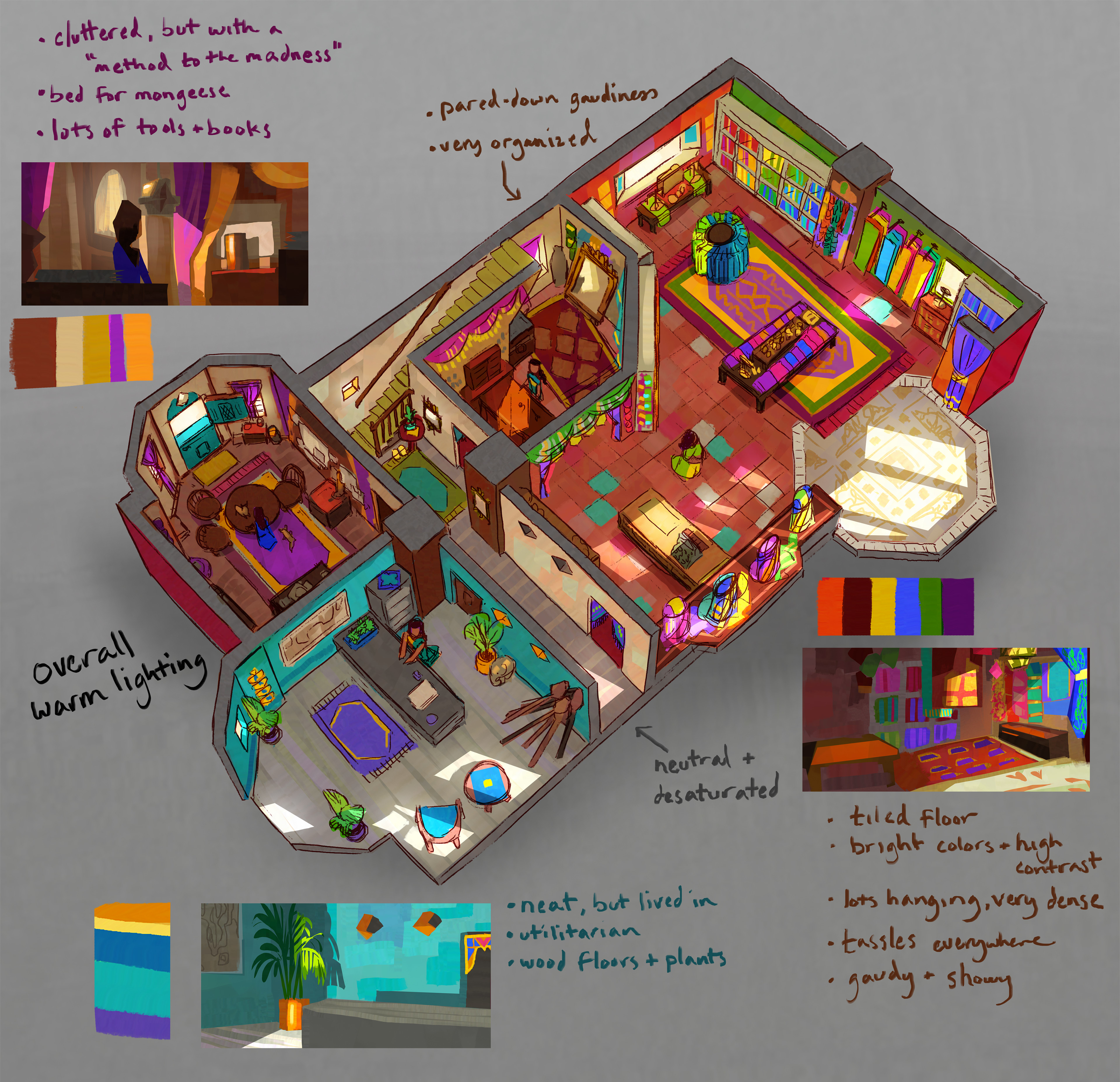
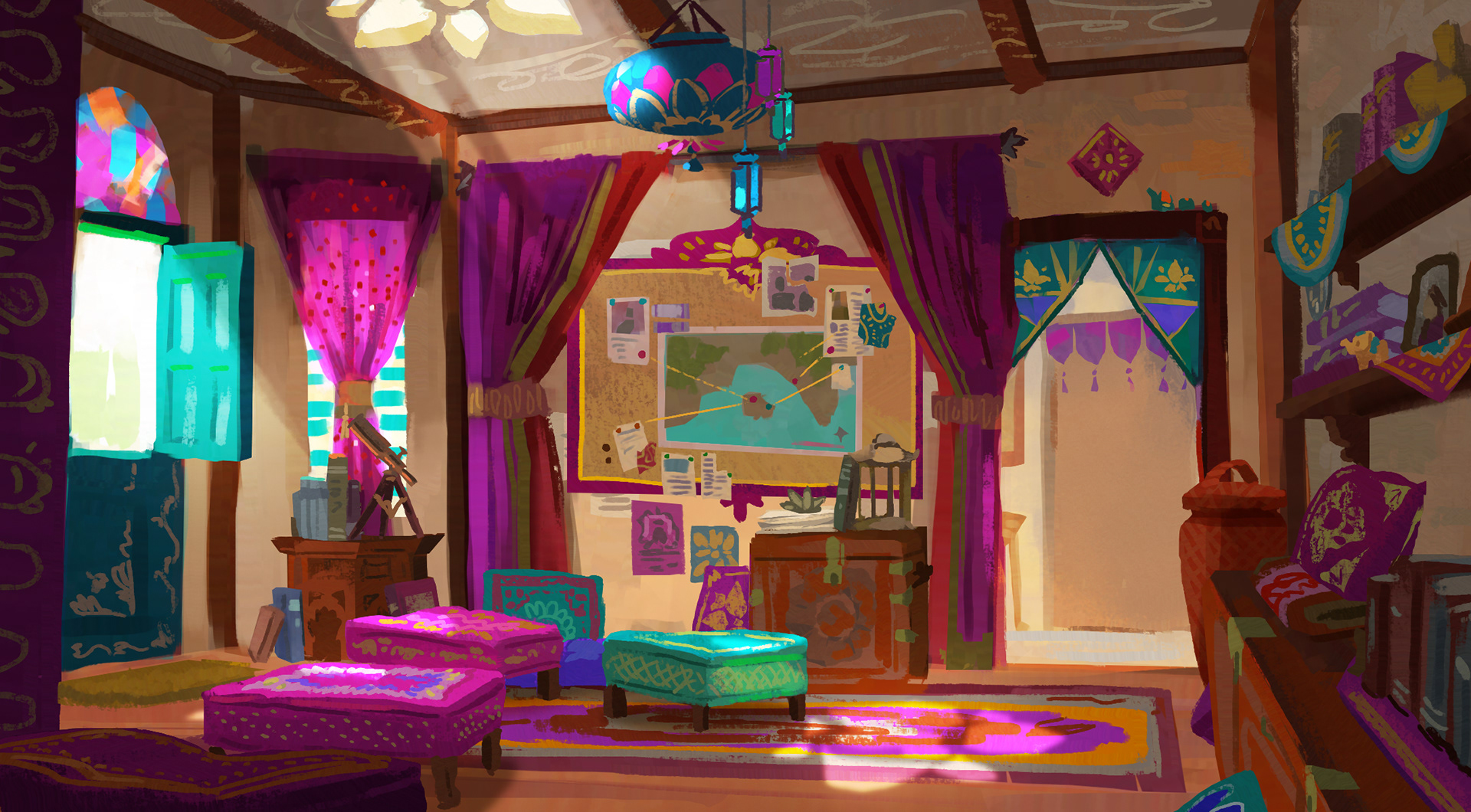
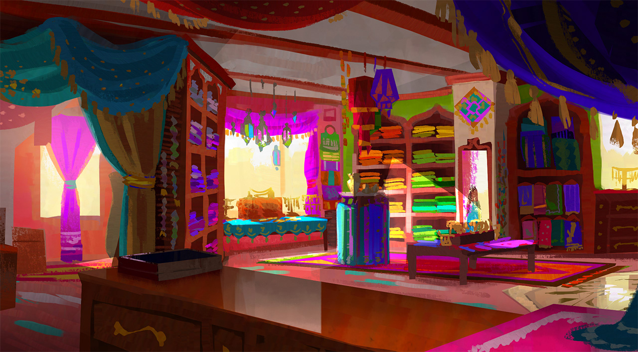
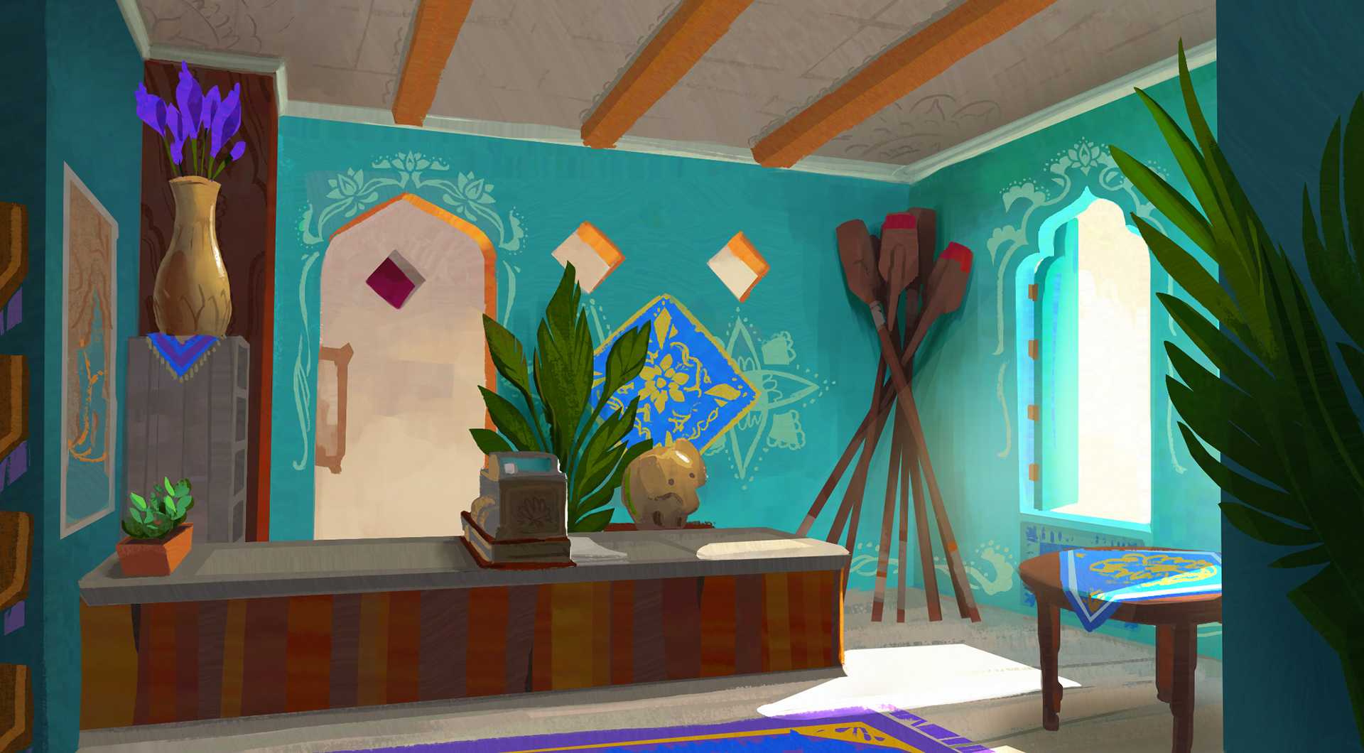
Mira's home originally had quadruple duty as a storefront, ferry service, design studio, and detective agency! Iterations tried to make each section feel distinct and reflect their respective characters.
The Natural World
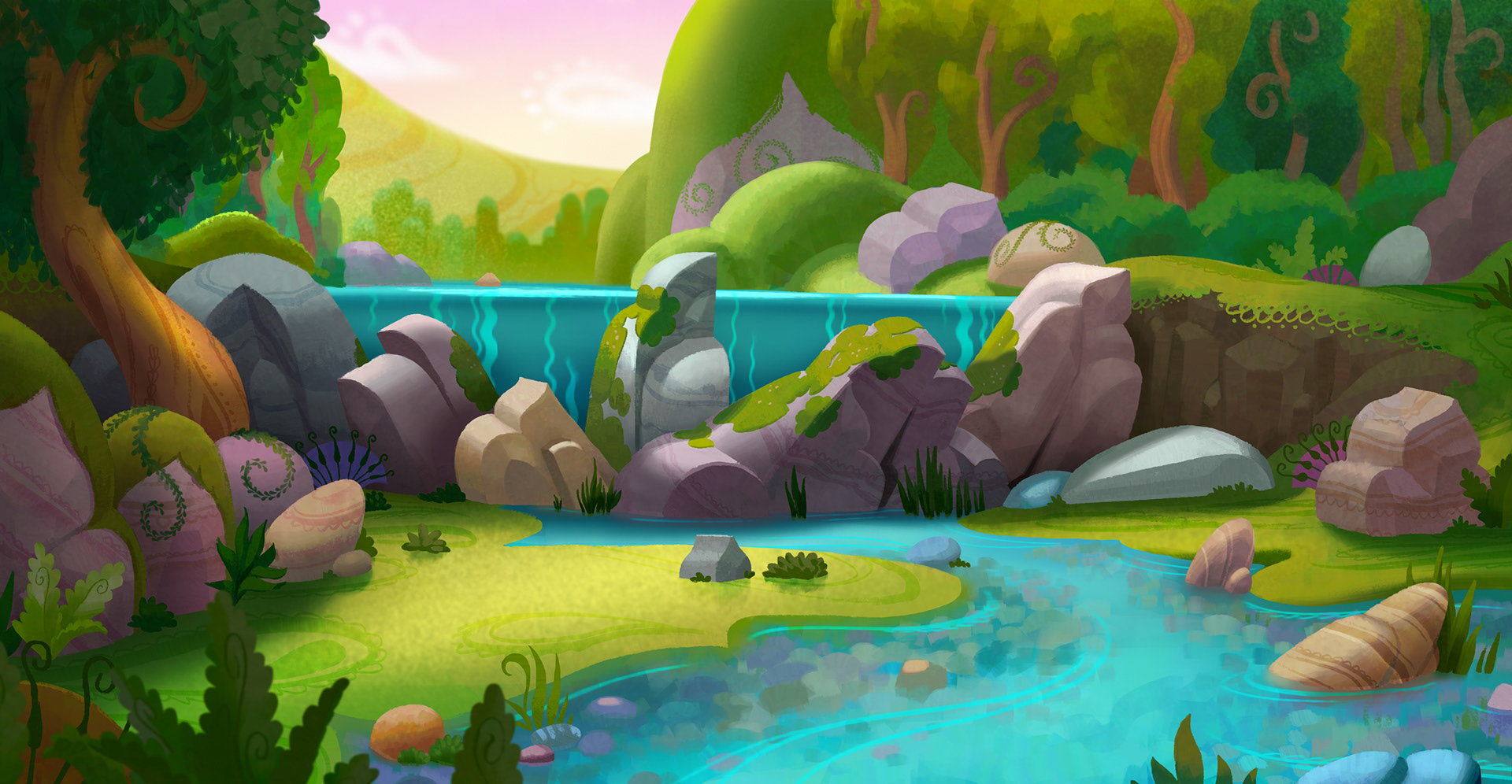
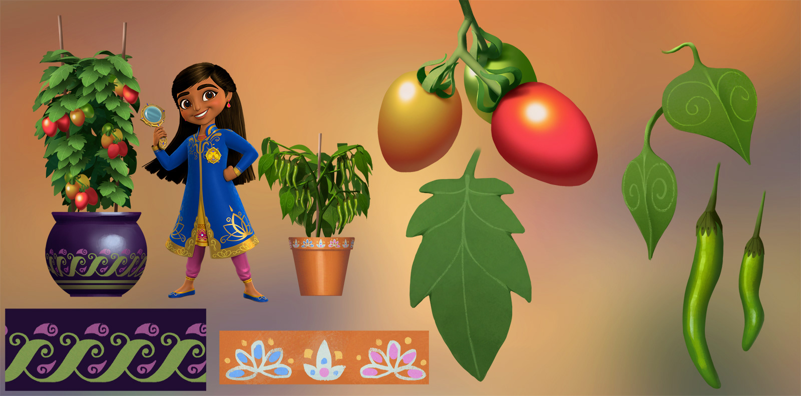
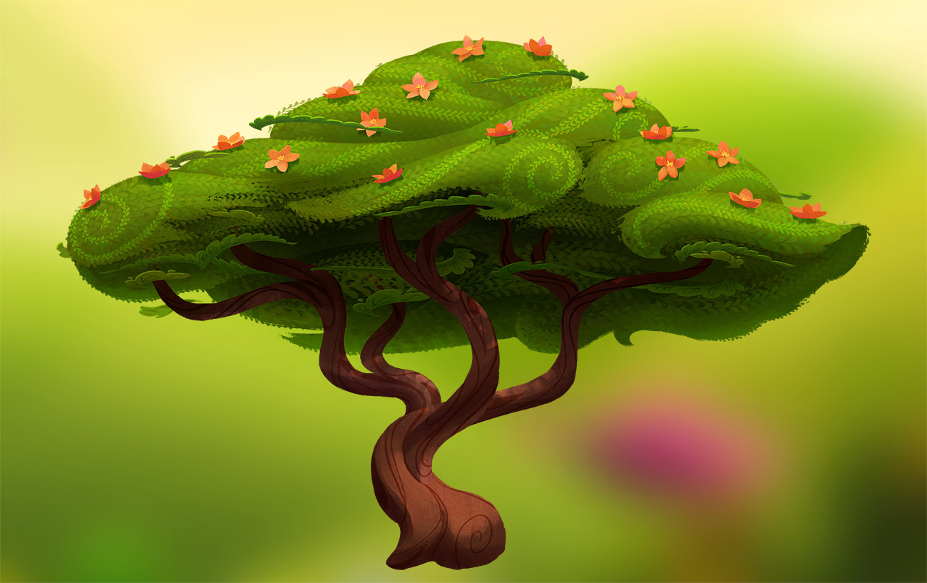
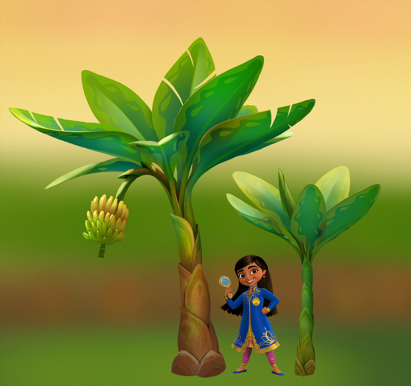
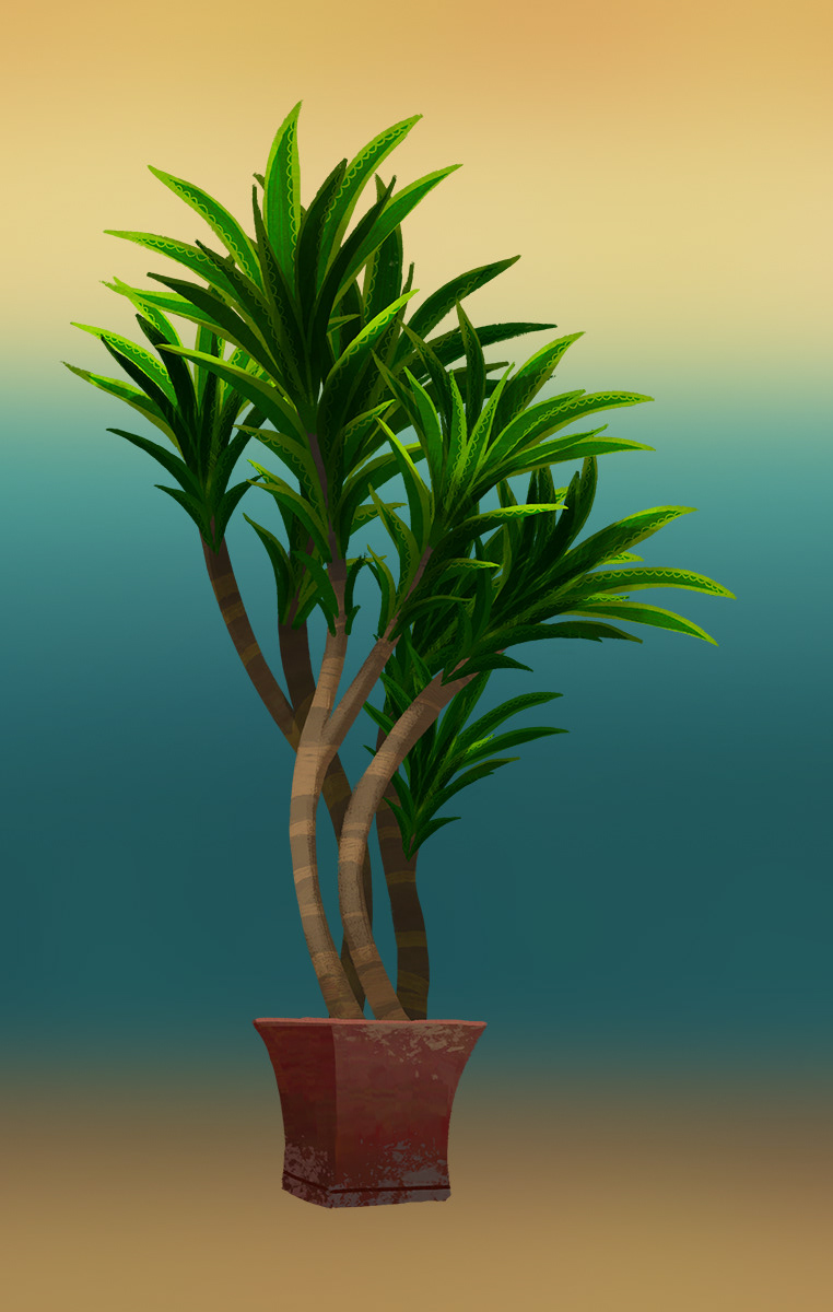
Whereas our cities were places where we really wanted to get across the authenticity and specificity of Indian culture, landscapes were a place to go hard on the abstraction. Rock forms have the swooping archway forms and vines grow in particular spiral patterns. The surface of leaves and tree trunks were other areas we could incorporate pattern into normally organic spaces.

Print Designs
Indian folk illustration and artwork has such an iconic style that we worked to incorporate it into our cityscapes with the use of wall murals. As someone who is enamored with wildlife, print designs were also a way for me to showcase India's diverse animals that otherwise couldn't be represented in the show.
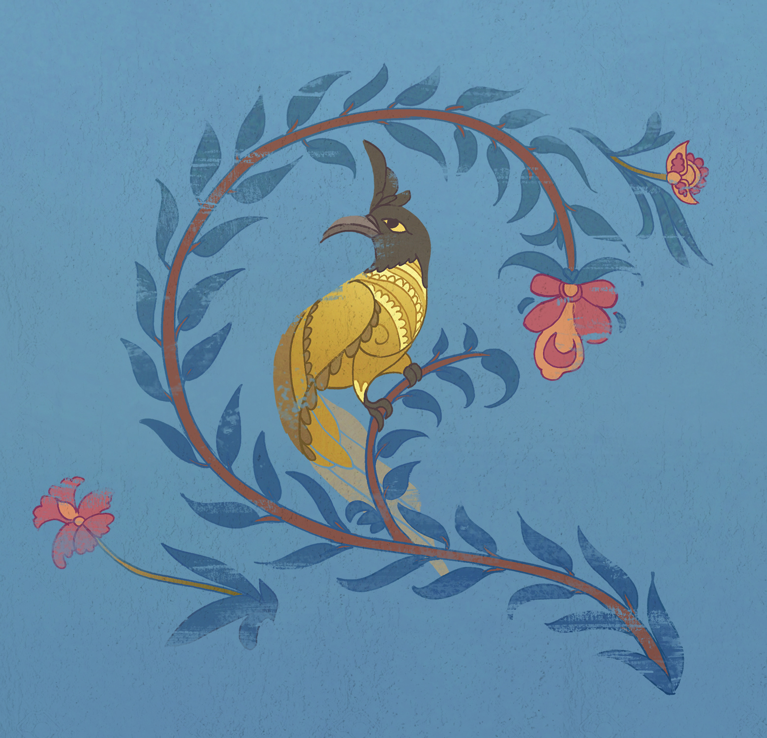
wall mural featuring the black-crested bulbul
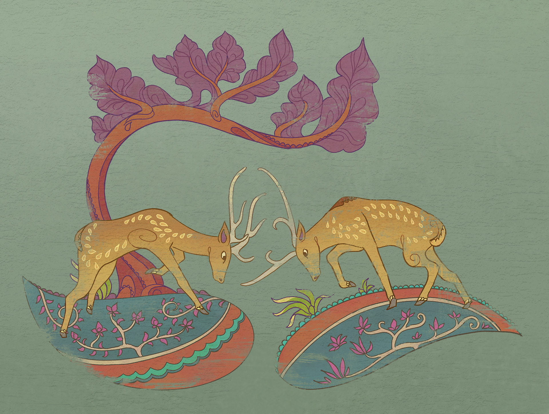
wall mural featuring the chital, or spotted deer
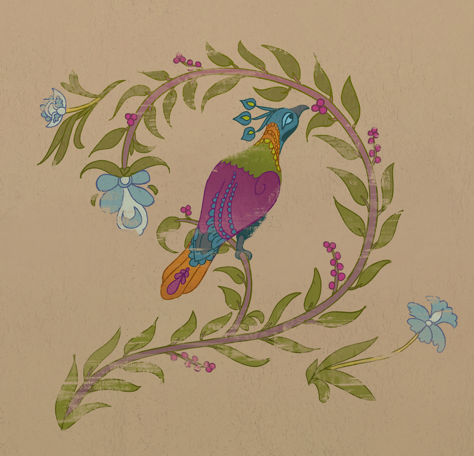
wall mural featuring the Himalayan monal
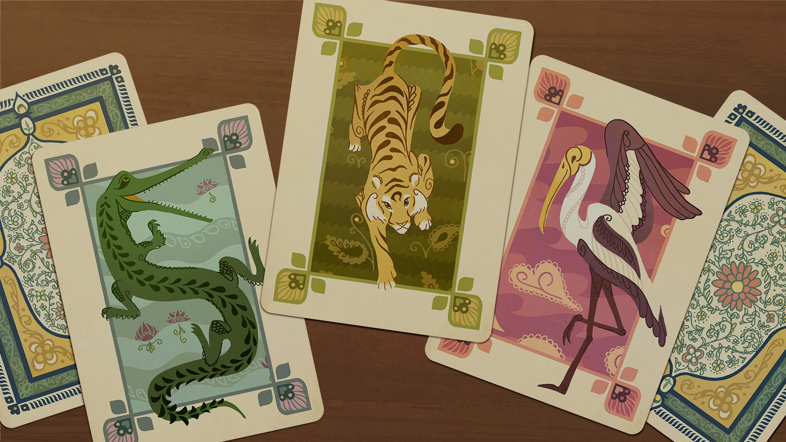
playing cards featuring a gharial, tiger, and ibis
Jalpur
More views from the city, inside and out.
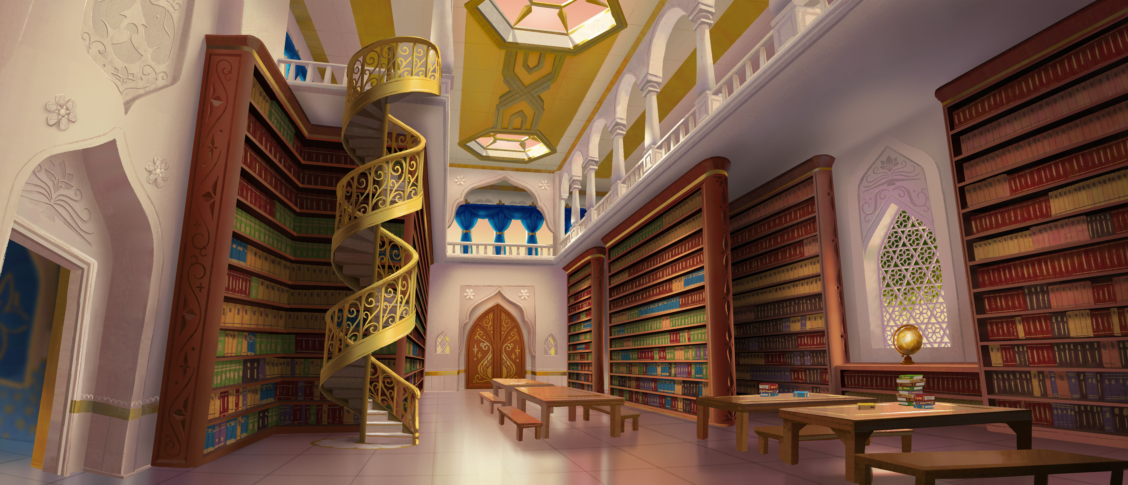
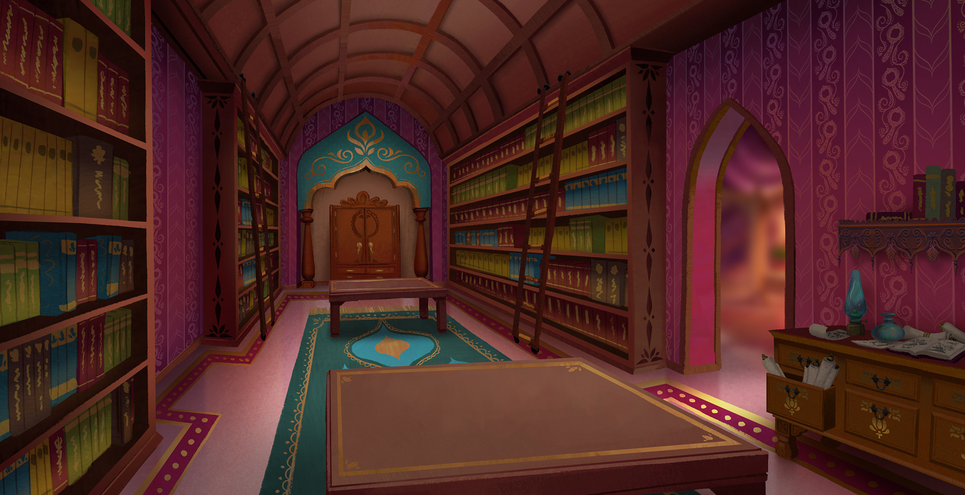
wallpaper and oil lamp design by Brittany Campbell, shelf design by Jia Wang
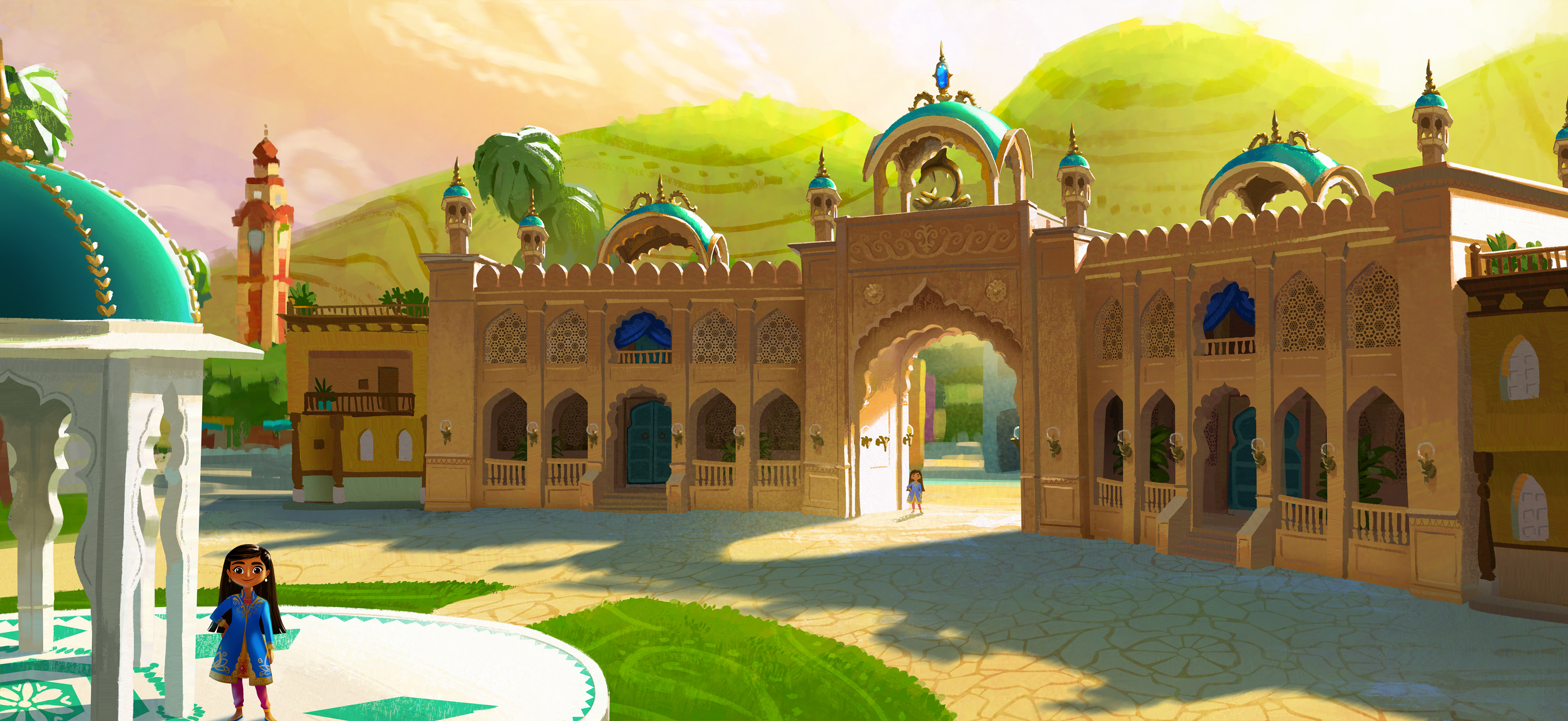
Many of our human spaces invite the natural world in, where we again try to bring order to the organic. Note the spiraling wall vines along the alleyway as well as the mandalas within the cobwebs.
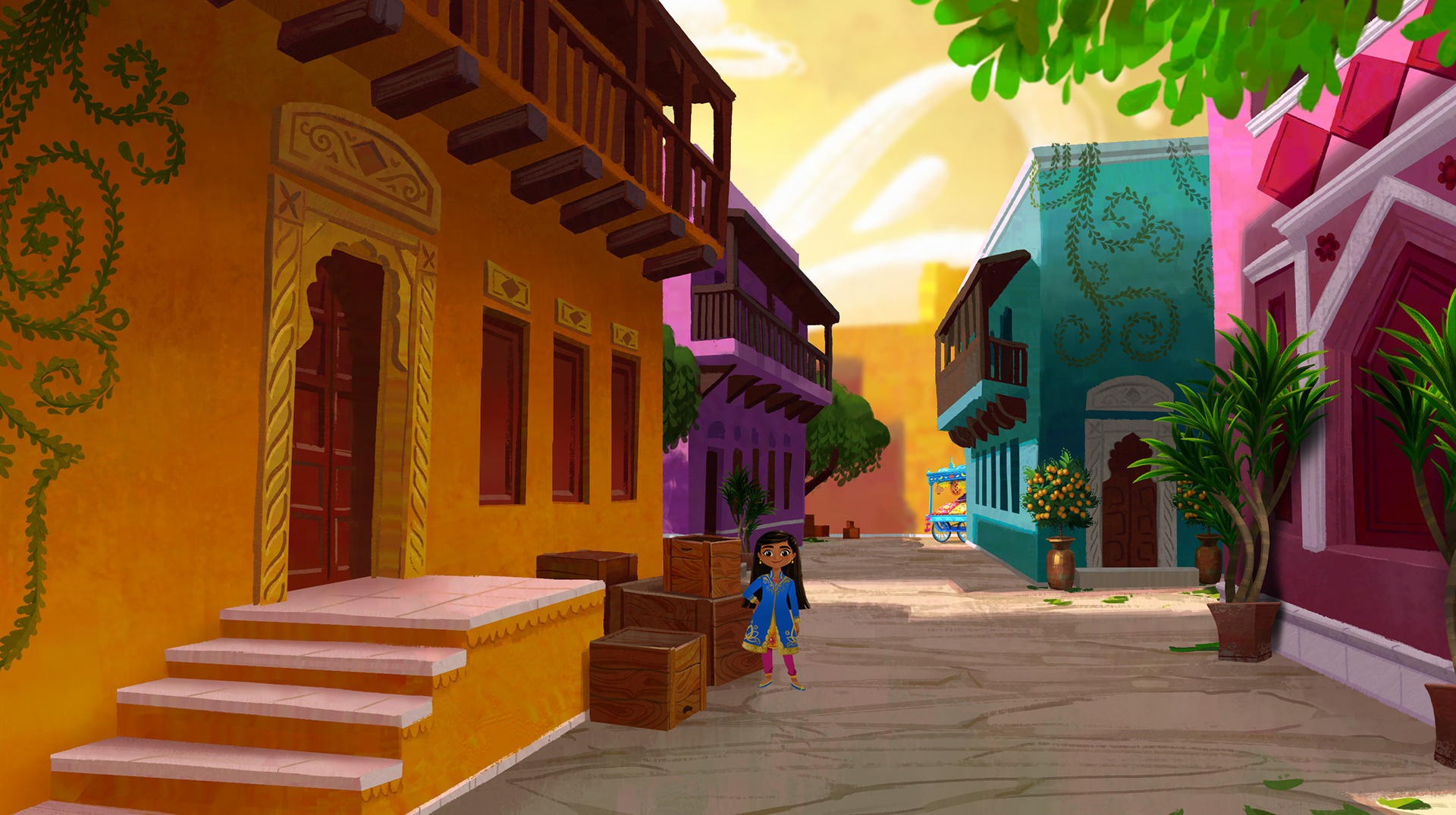
fruit cart design by Michelle Lin, mandarin tree design by Brittany Campbell
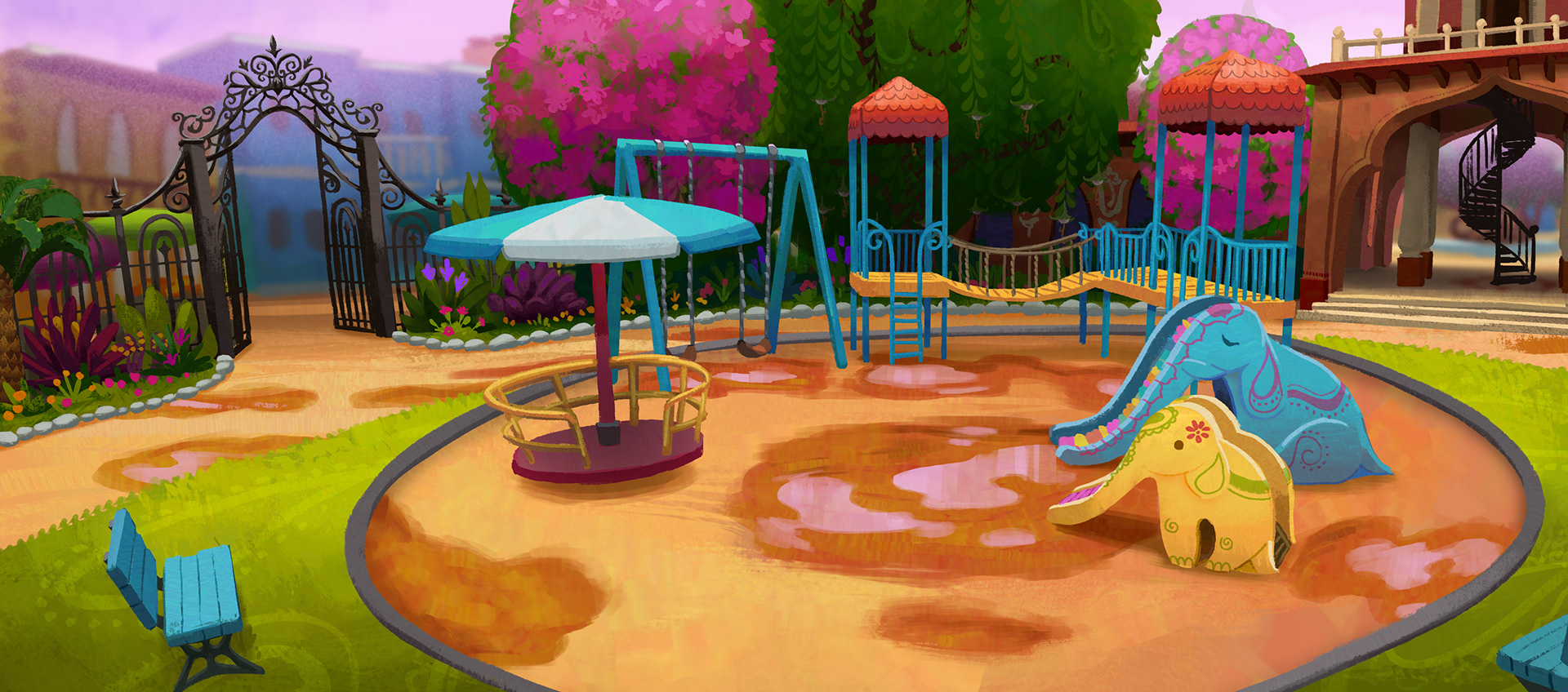
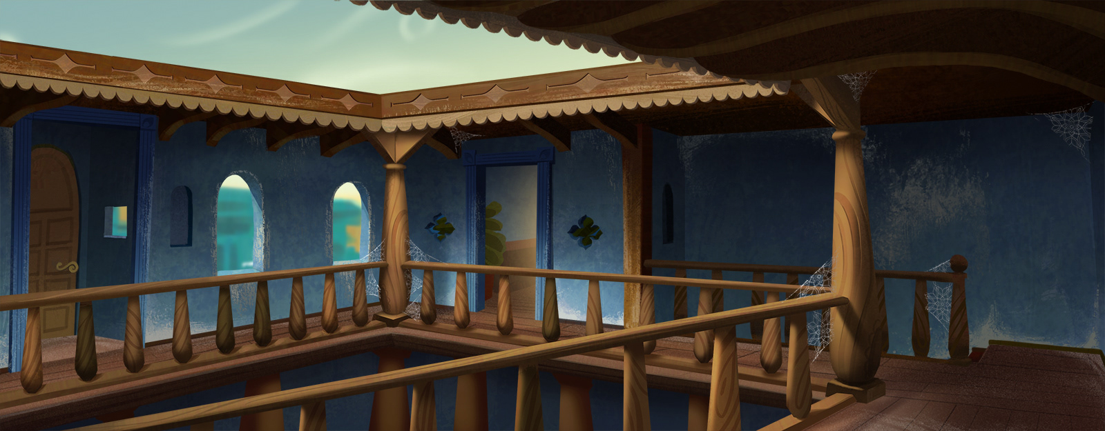
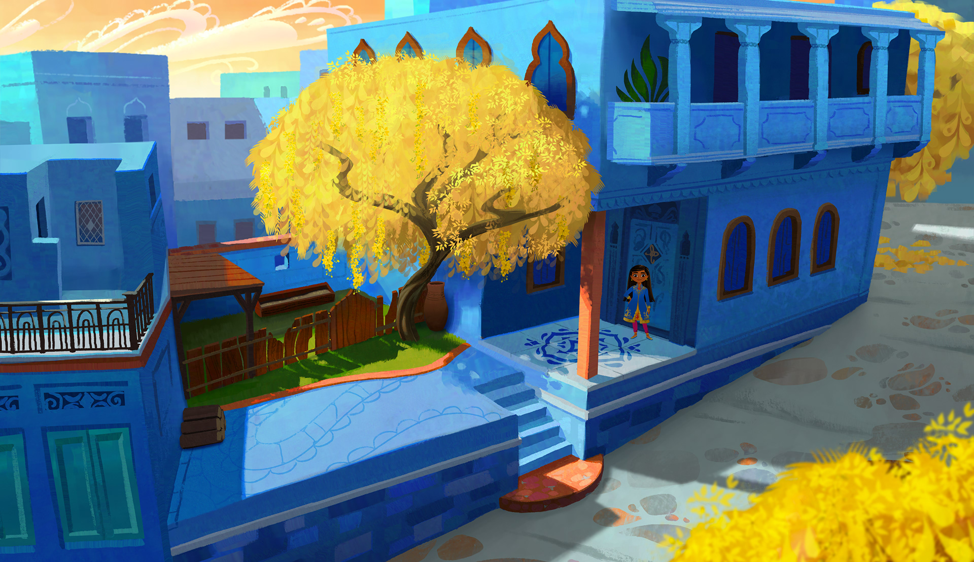
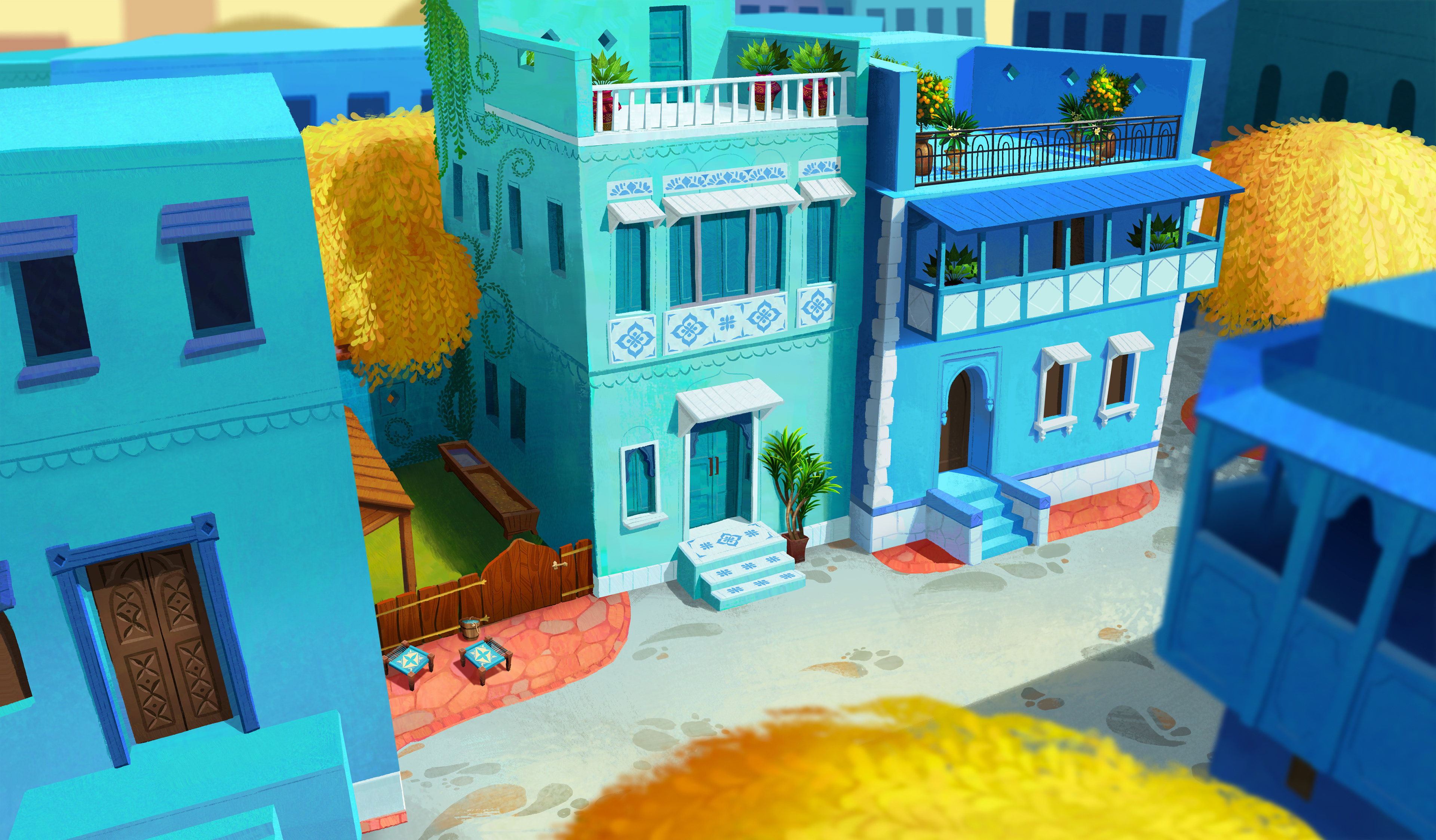
The residential area of the city was heavily inspired by the real life blue city of Jodhpur. Here, I opted to use a primary color scheme we have in other places of Jalpur, but bring the reds to a minimum and keep the yellow to only the trees. Slight variations in the blues and teals of the facades help to provide visual interest.
